Hanna Shibata
I created a brand and package design using one of our standard Fathom effects, the “Watch” series, to showcase a potential approach. It is a minimalist branding/packaging approach that works well with Fathom’s print motion effects.
Inspiration


The colors and the form of Watch & Co. are inspired by a latte’s creamy texture.
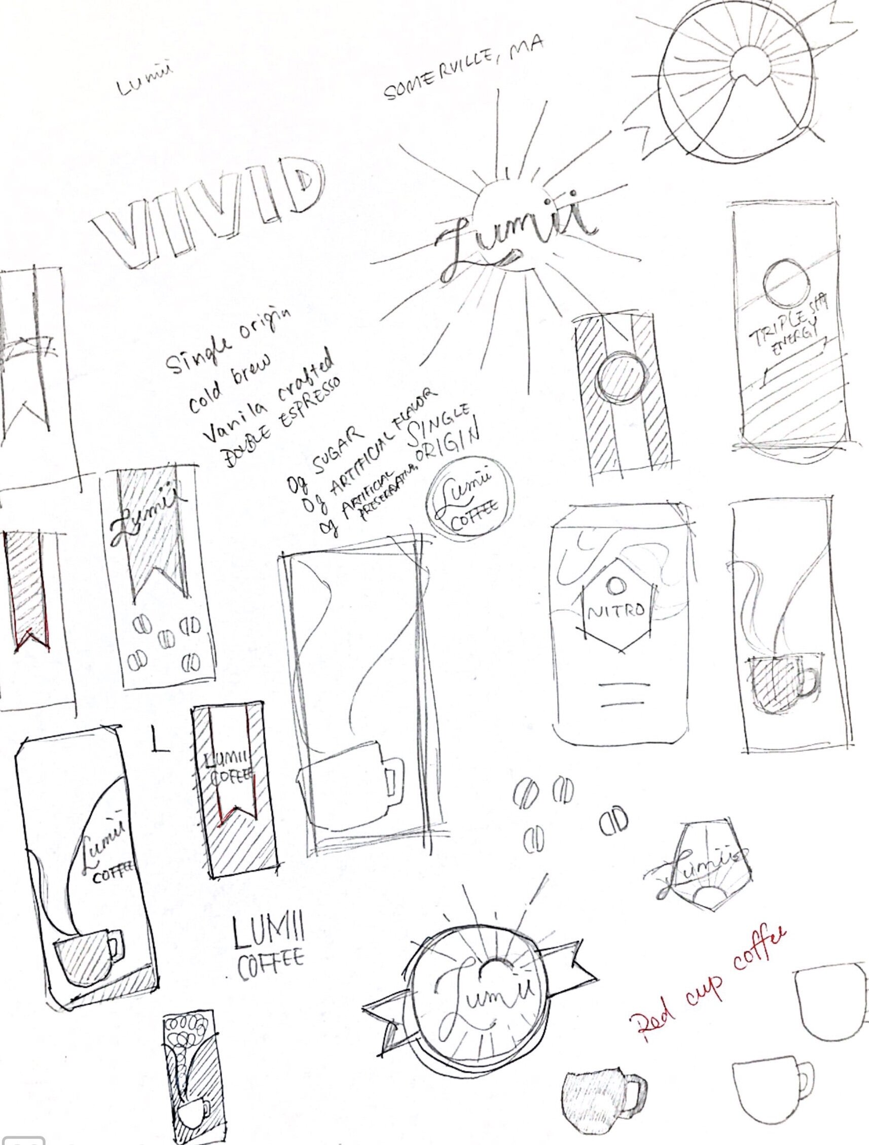
Sketching

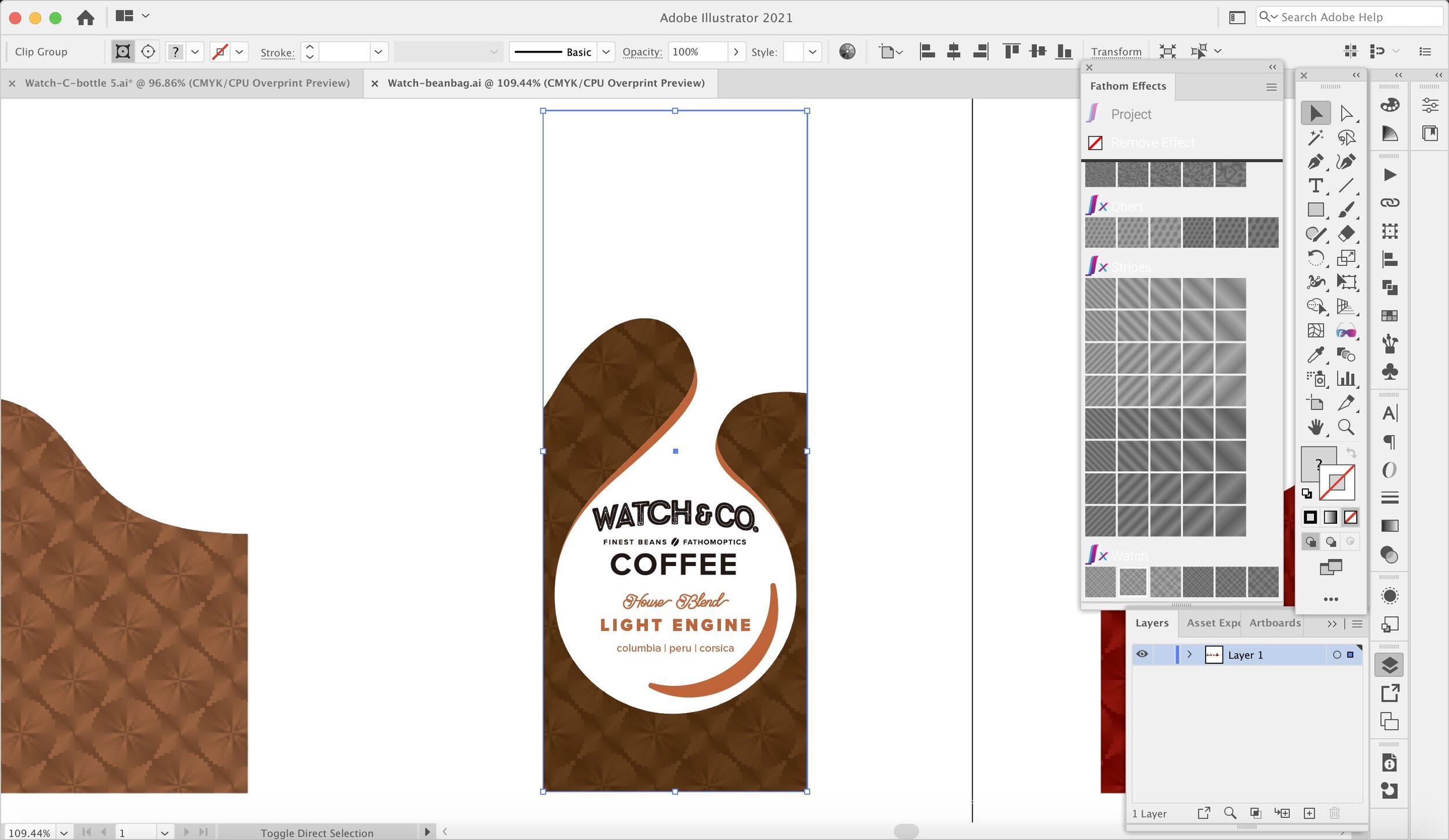
Adding Motion Effects in Illustrator


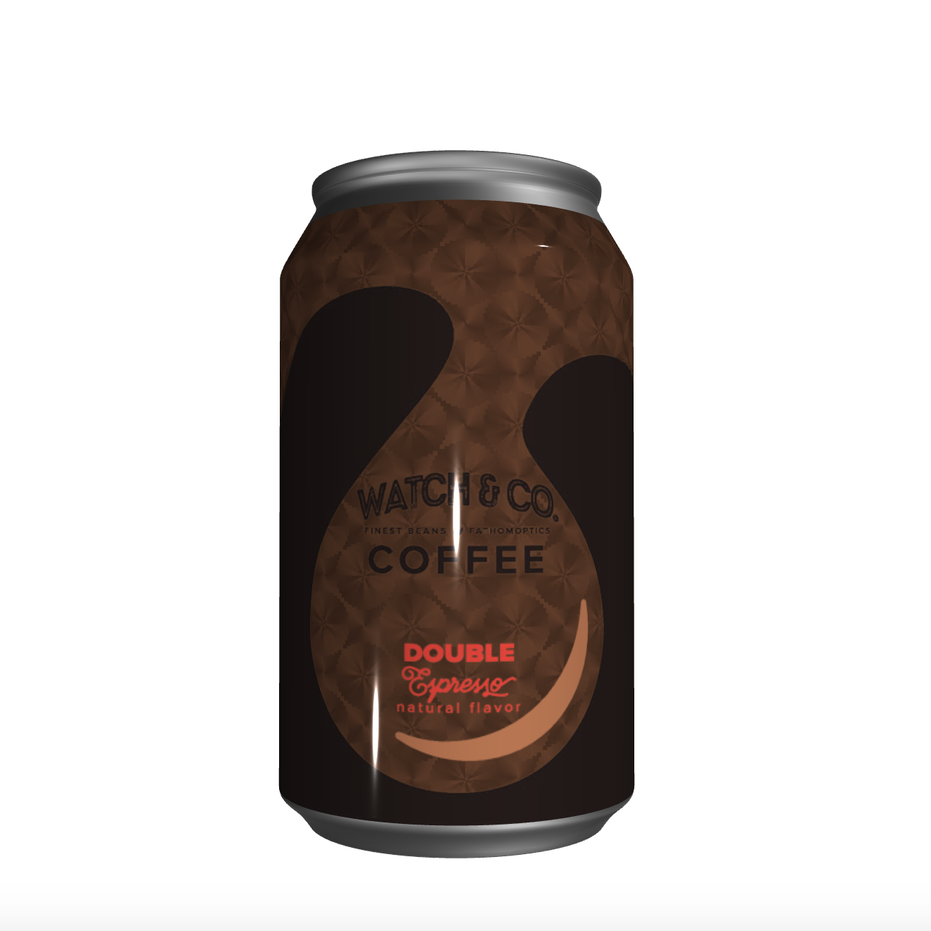
Once I’ve executed a design in Illustrator, it’s easy to give it an extra dimension by assigning a Fathom effect to a spot color. Here I’ve chosen for our brand the appropriately named Watch, picking one from a palette of scales and contrasts.
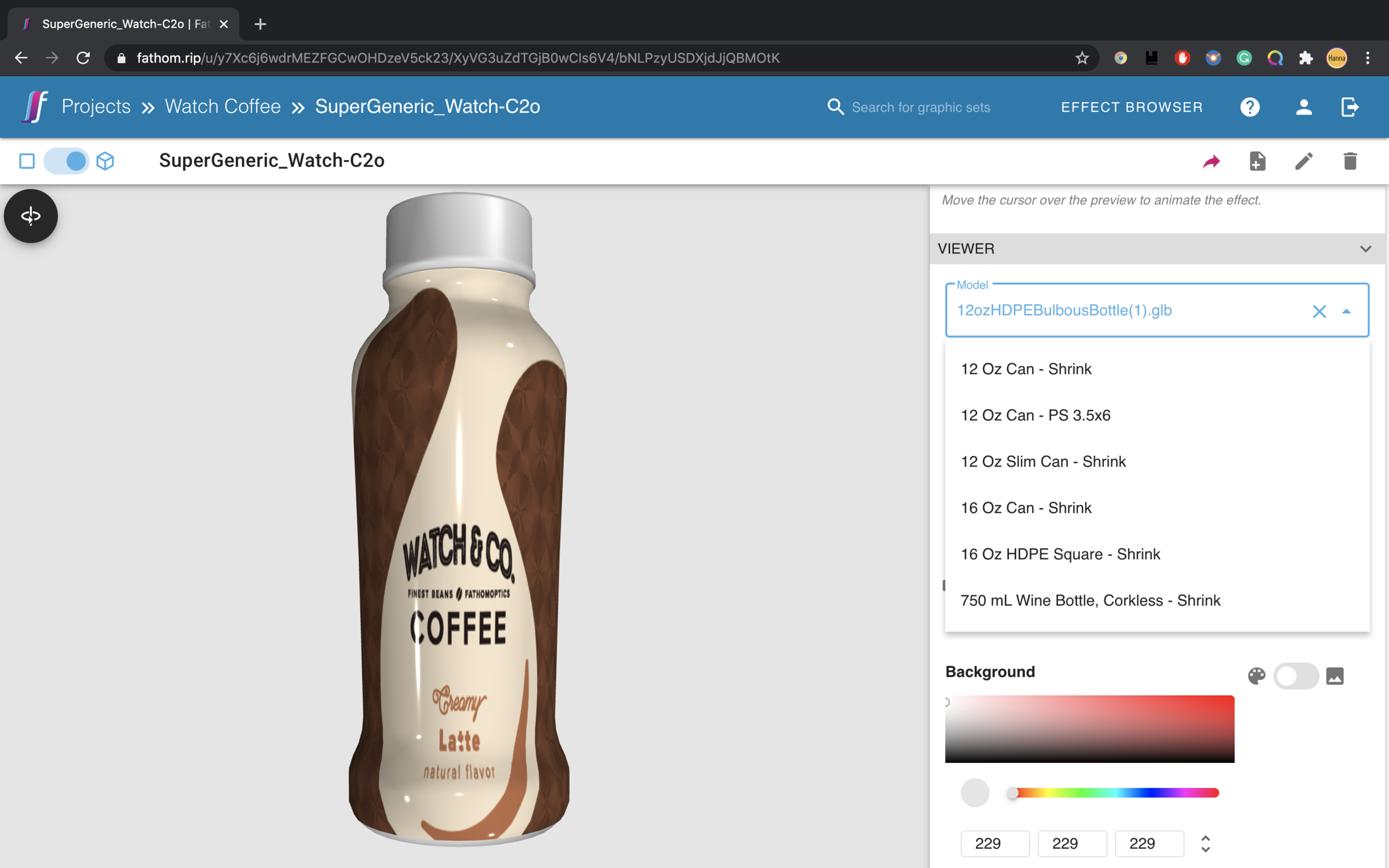
3D Visualization
The Fathom effect changes depending on your viewing angle, so while we can preview the motion with the Illustrator plugin, we want to be able to visualize it in 3D. The plugin will upload the file to Fathom’s site, where we can preview it on a number of containers.
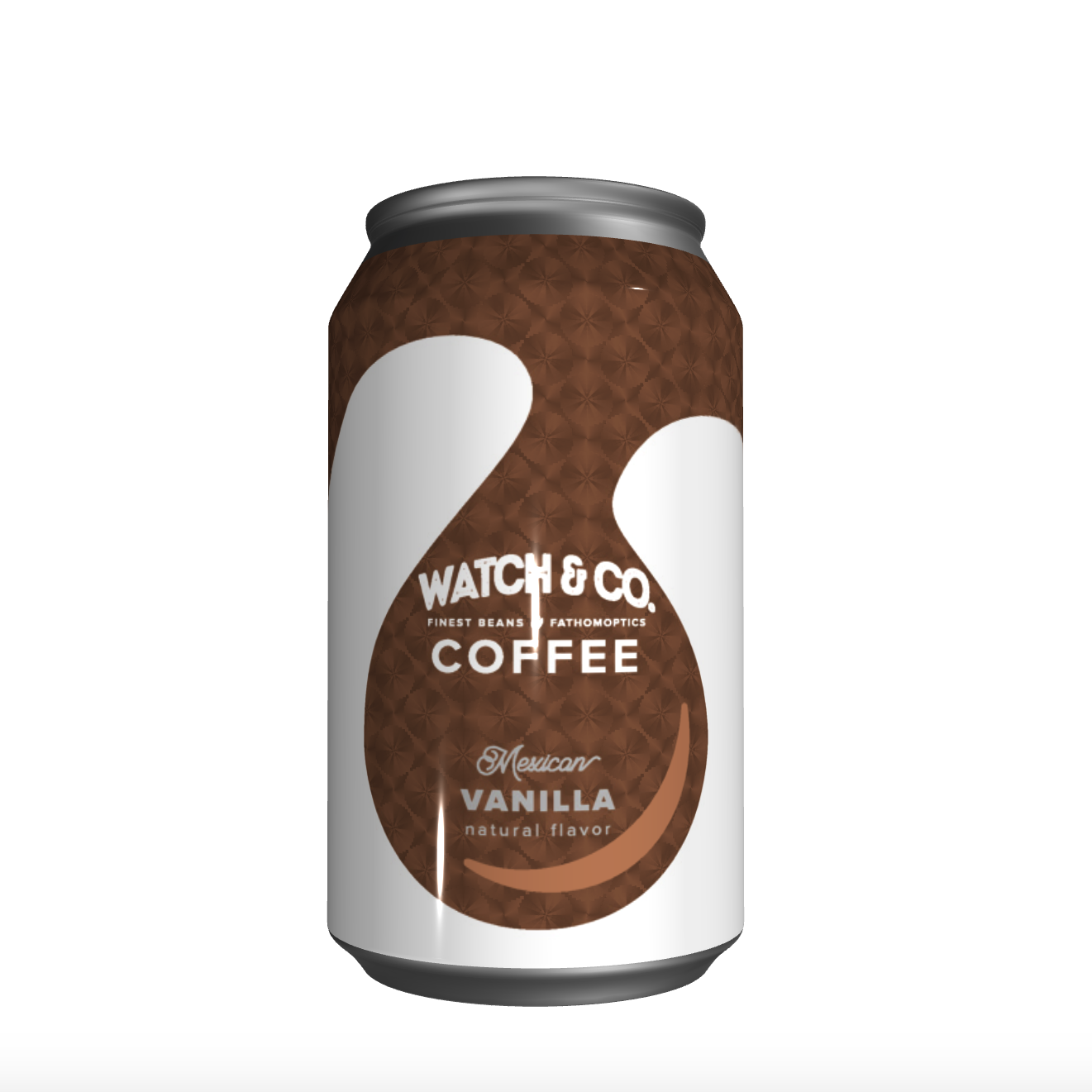
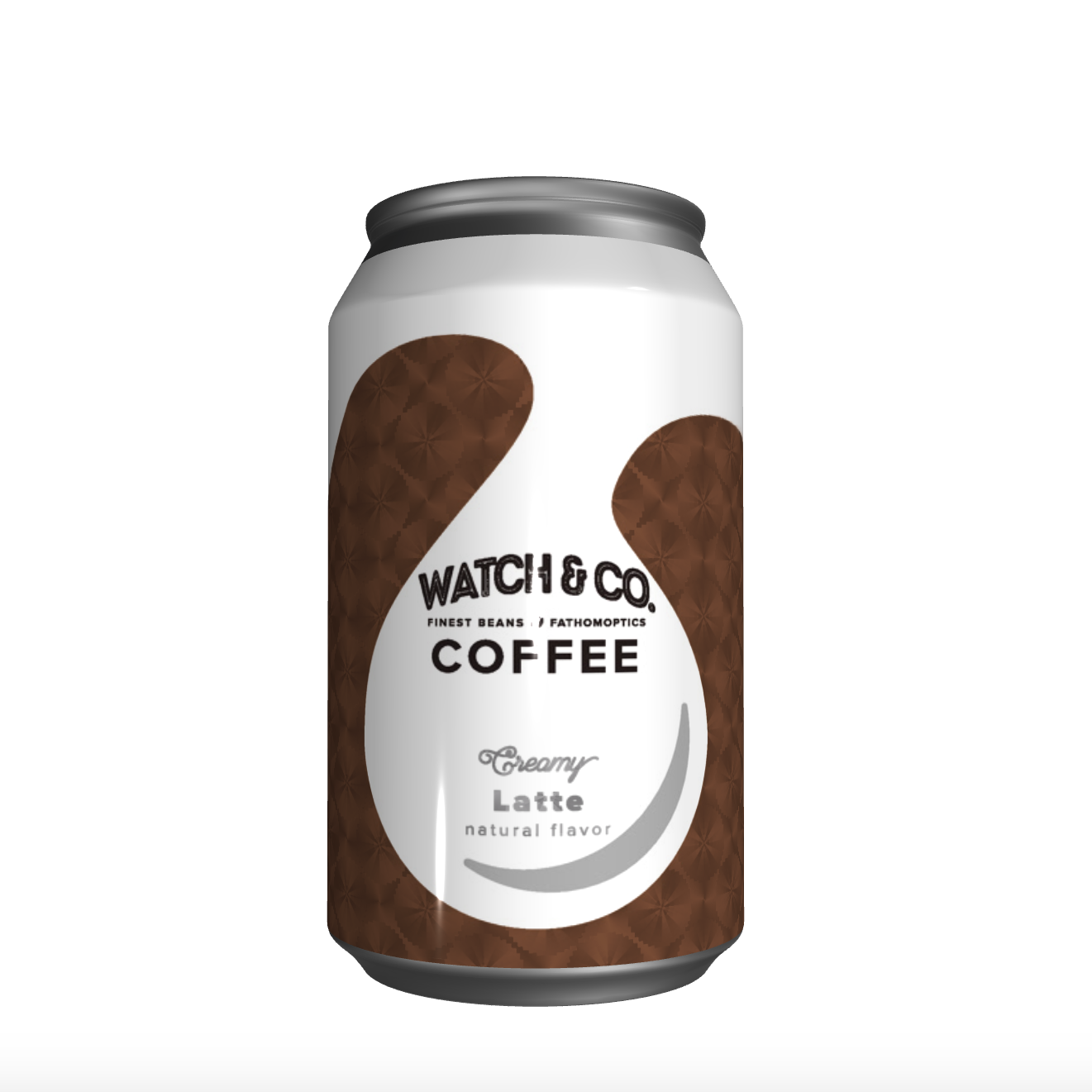
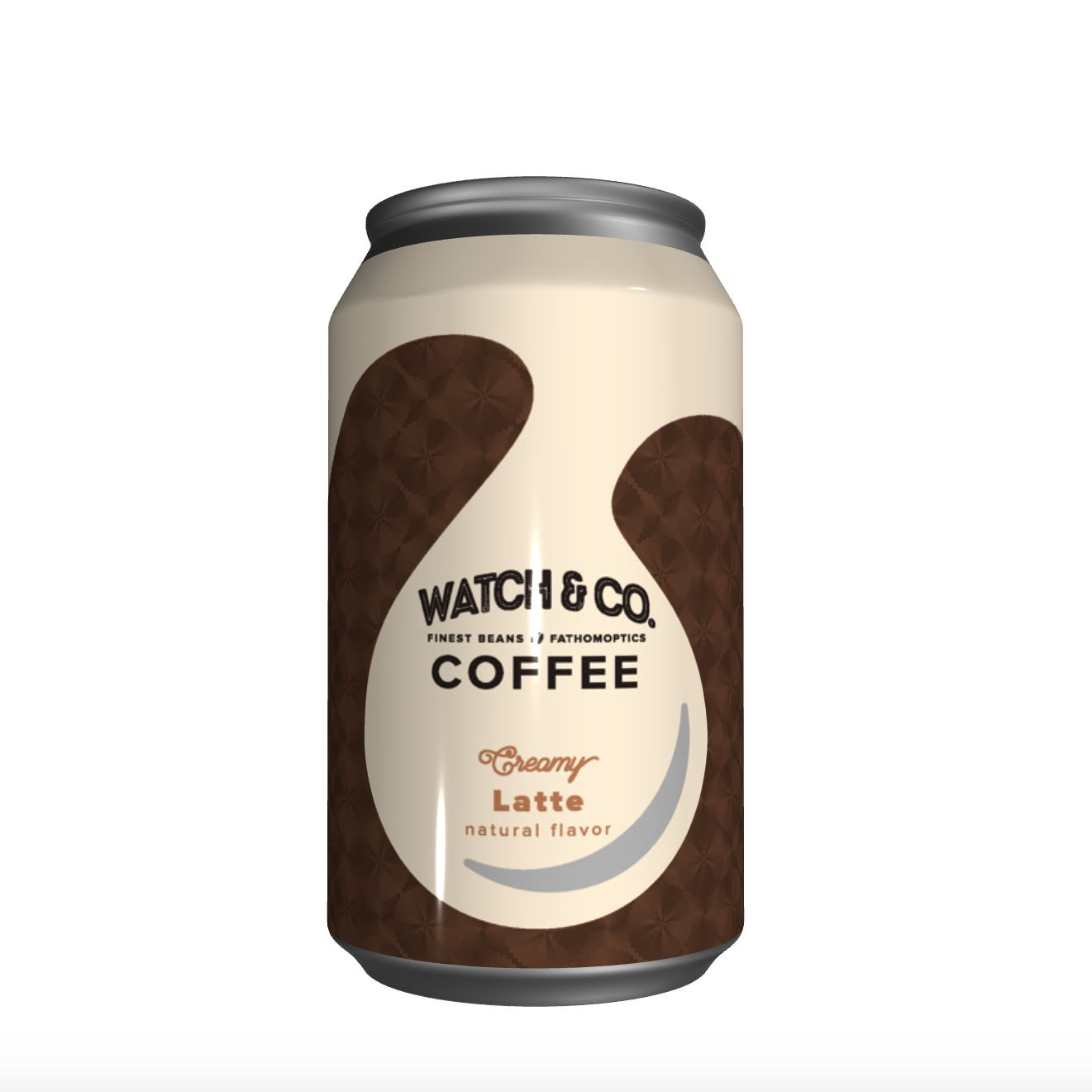
Here you can see the design on a can, without and with the effect.

The ratio for the can does not fit to another form.
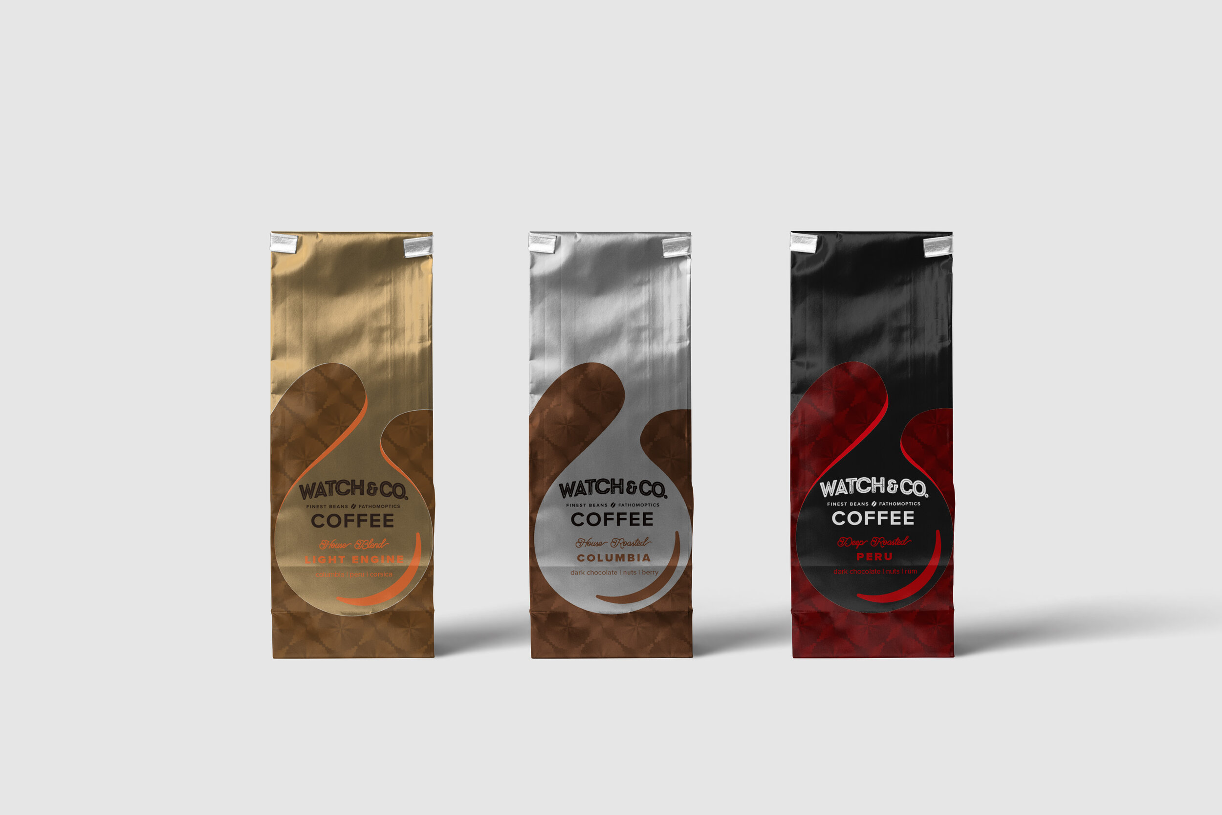
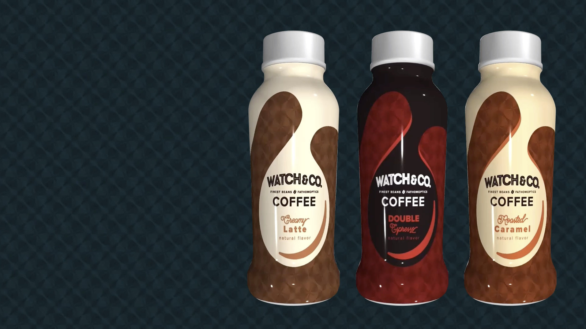
While choosing the direction of design and colors, we decided to create another model, which requires some visual adjustments. Our rapid 3D modeling enables designers to adjust the graphic in different forms.


We can then share the preview to get approval from stakeholders.
Click and drag the can with your mouse or finger (Chrome/Firefox only)
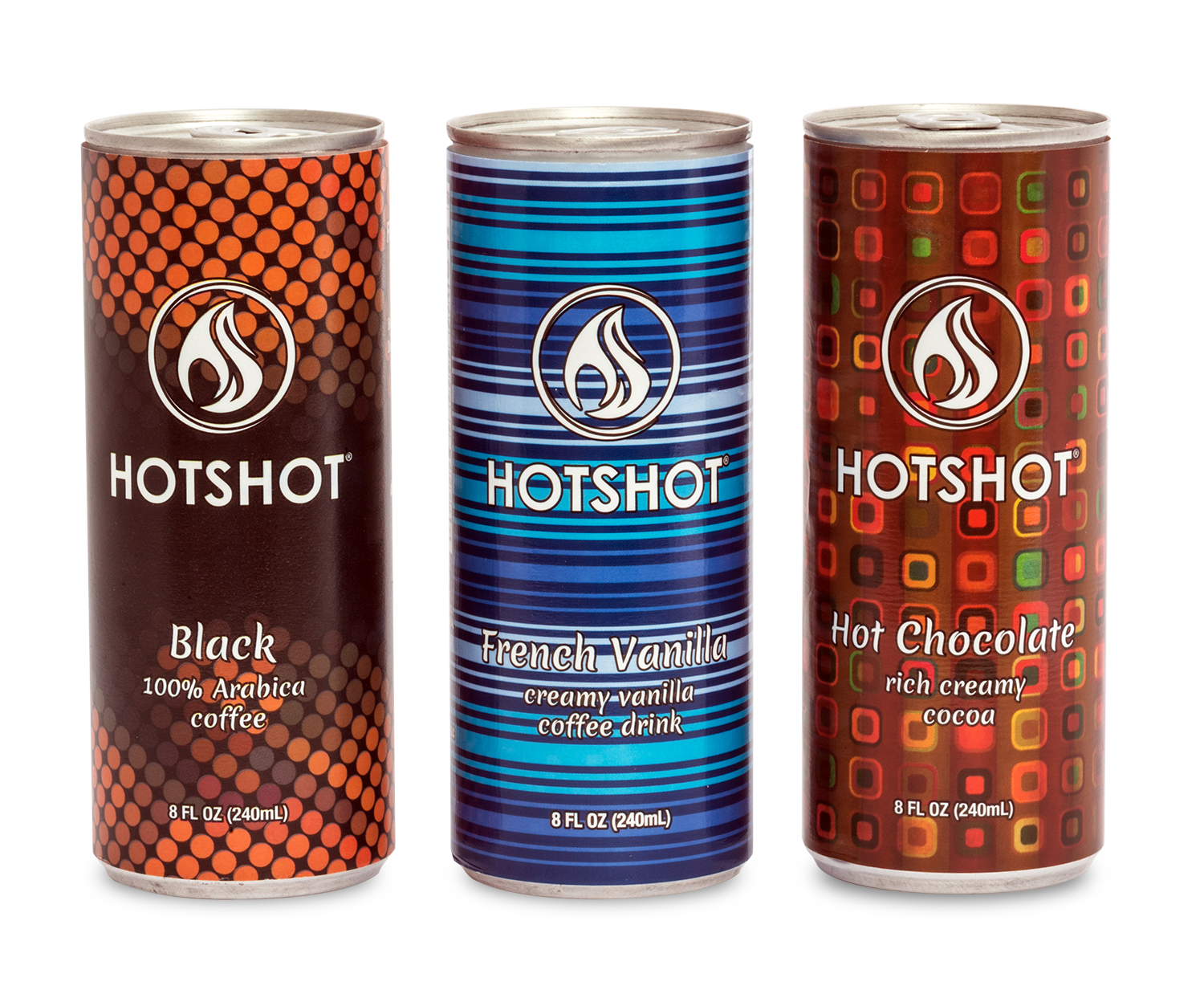
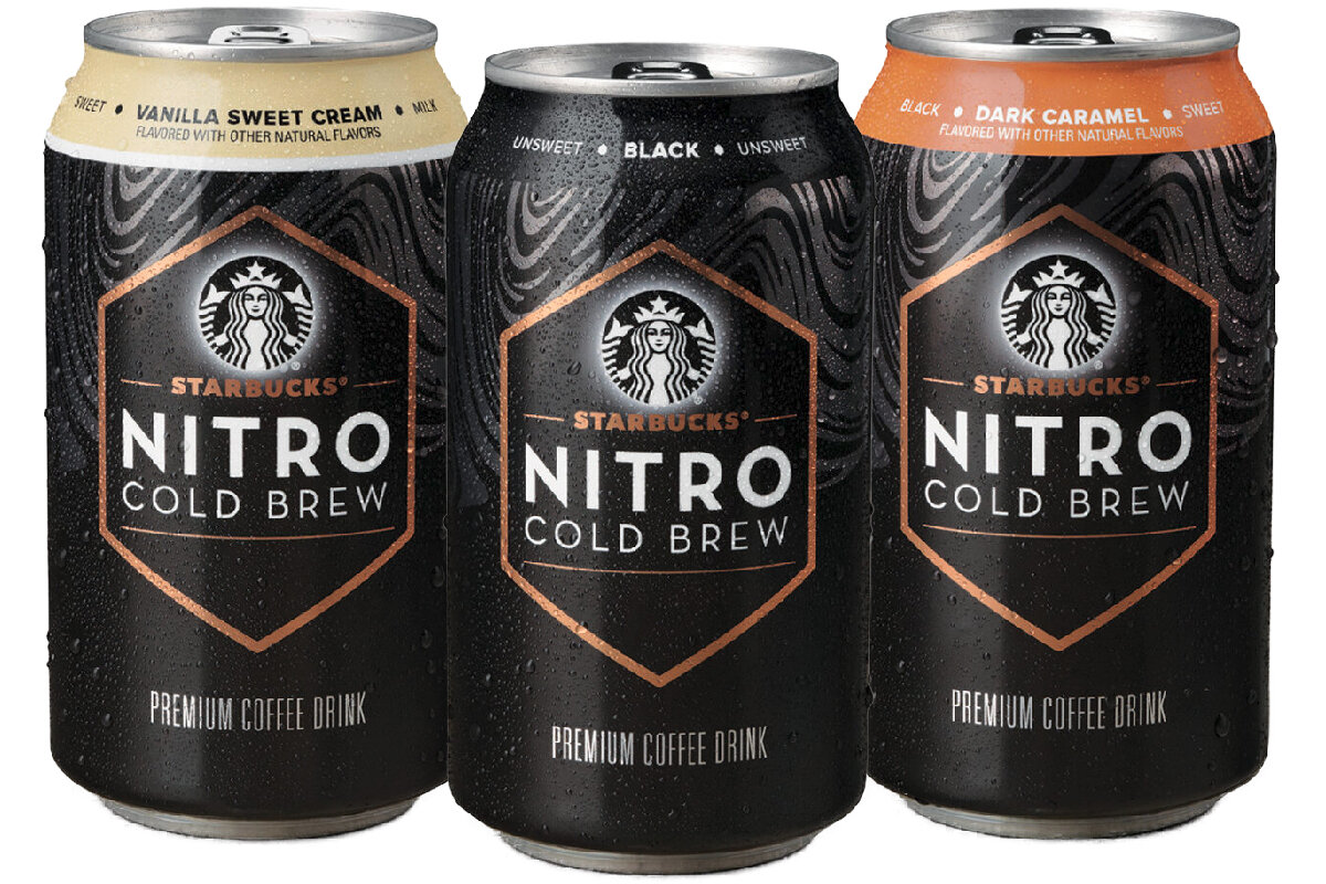
Extended family
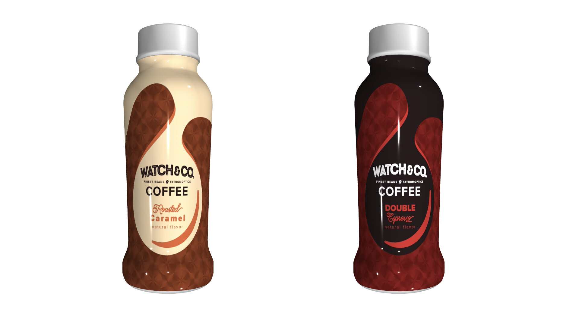
By using Fathom’s Adobe Illustrator plug-in, it is easy to play around the brand visuals in different media. Expansion of the product lineup is also in the plan, supported by a vivid tone to create contrast in the family.