
By Niko Arranz
The CBD market has exploded in recent years with many different emerging businesses. That means more competition on the shelf within a limited amount of dispensaries. I wanted to showcase how Fathom can help enhance products and make them stick out among the other brands.
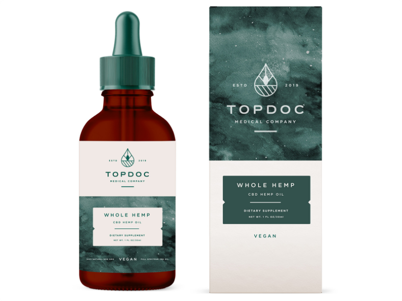
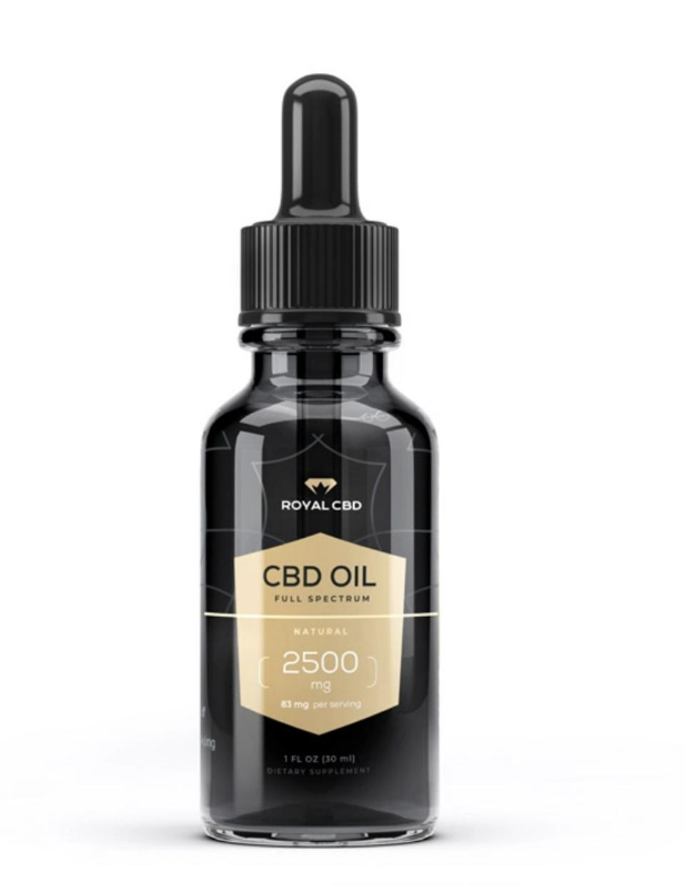
Many companies are trying to pivot the general opinion consumers have of CBD. In the past, CBD and other cannabis-based products have been associated with grassroots and DIY designs. But it is noticeable that brands nowadays are trying to formalize this image. For the Perx brand, the goal was to be modern while also still having a retro psychedelic flair. Similar to a business casual aura.
Inspiration
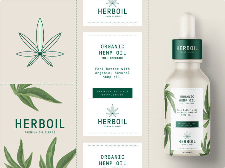
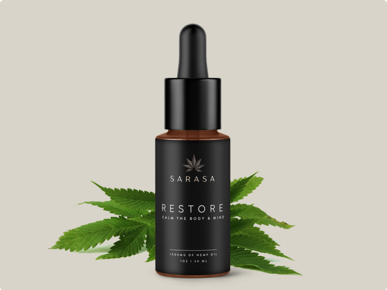
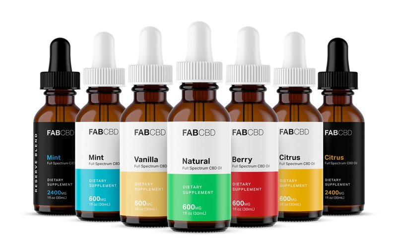
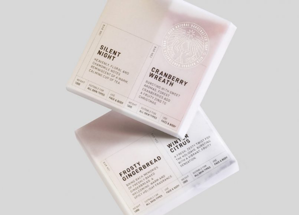
The mood board created for this project had a lot of packaging that had pale color tones and clean simplicity. Most of which are medical-based designs. These are usually simple in form and easy to read.
Design process
Initial rough concepts went over Fathom effect placement. A big importance of this design was to have a green effect alongside a black and white color scheme. The green effect would be a clear visible cue of CBD product while the black and white color scheme would stay aligned to the intended branding.
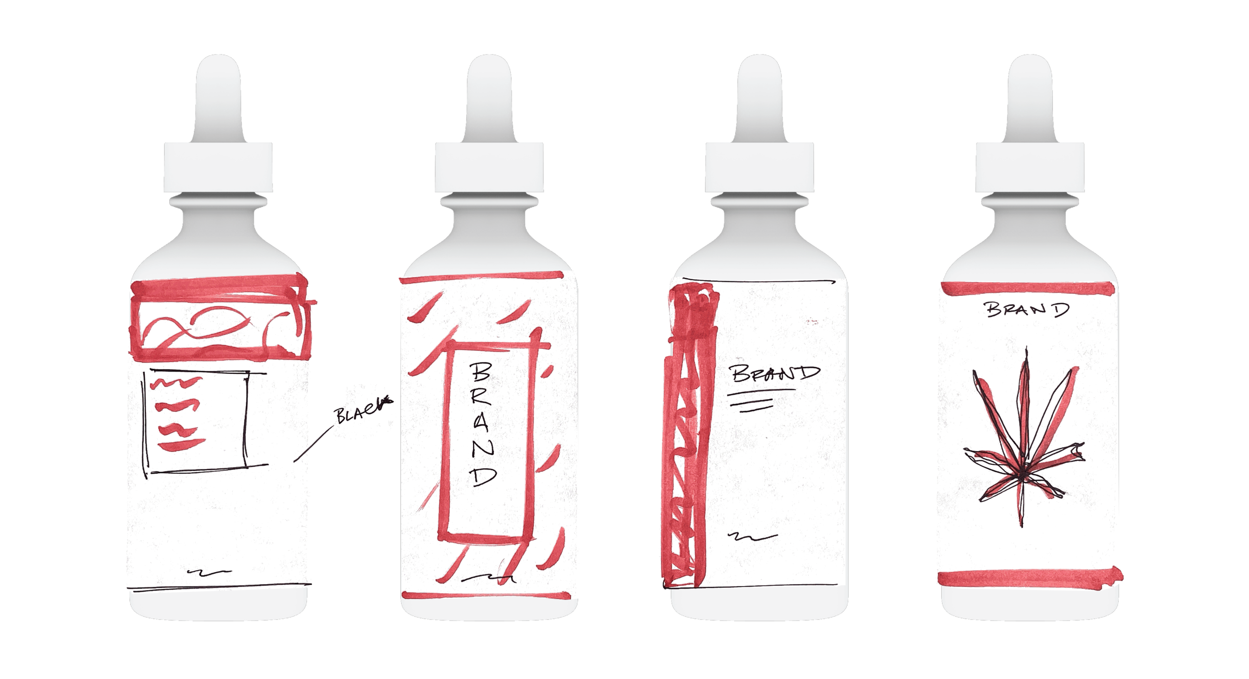
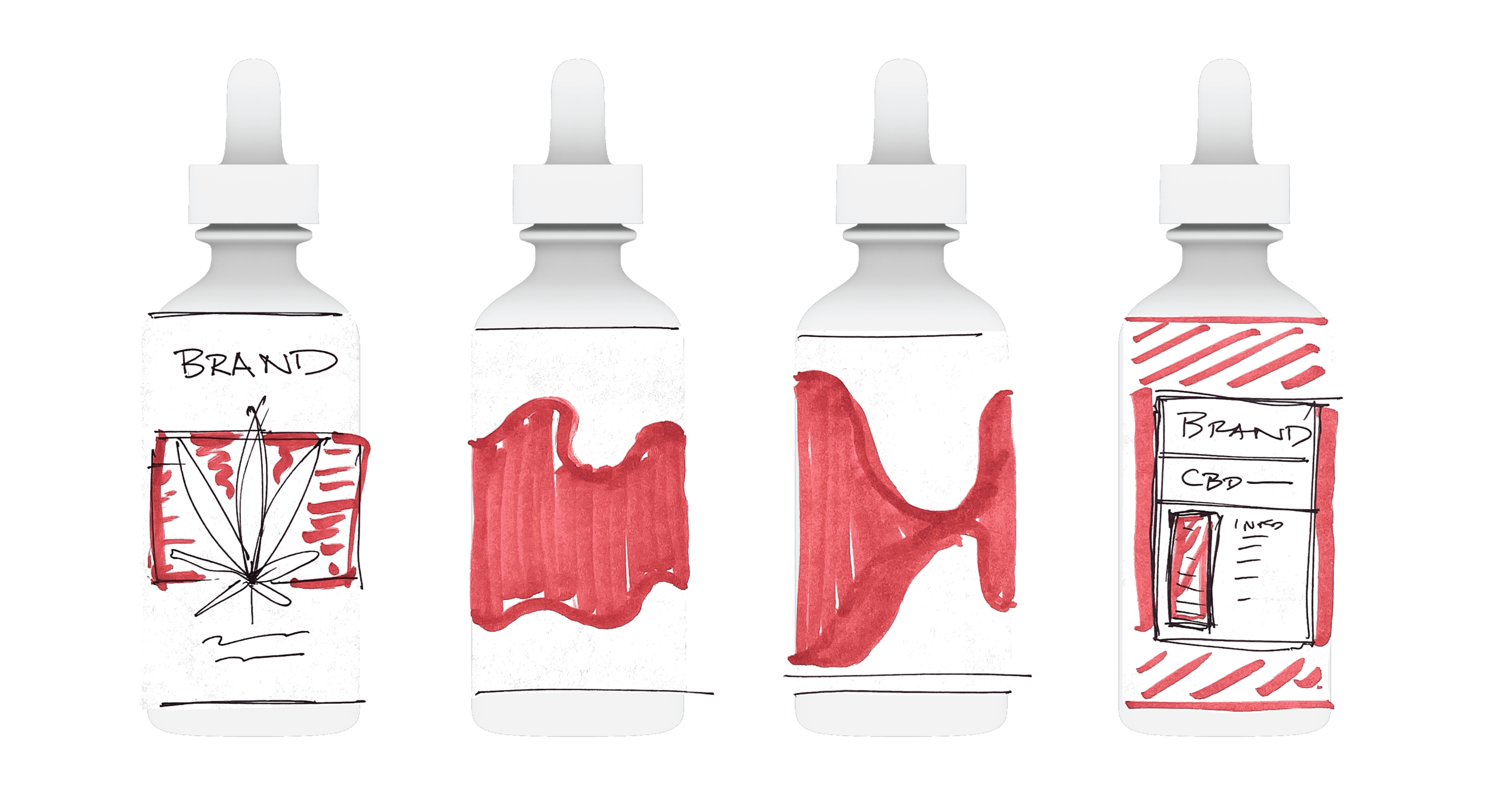
Rapid testing with Fathom Designer
A range of rapid ideas were uploaded to the Fathom Designer website, testing out different placements of the effects and sizing.
Focus on green banner and expansion
For that flair, several standard effects with different green overprints at Fathom were considered. The Perlinescent and Eggcrate effects were the most appealing as they were organically fluid and very visual. In addition to the standard effects in the Fathom library, custom effects can also be added. An effect with a leaf pattern was provided by the Fathom team.

Conclusive Design
Through the Fathom Designer site, this design can be shared with a generated sharelink (such as this one). Stakeholders, brand managers, and anyone involved with the design process can interact with the label and actively see the effect.
After further design discussion within the team, the label chosen was the straight border alongside the Eggcrate Fathom effect. The pale green overprint matched the cool grey color palette of the label, obtaining that modern look that was sought after. A simple clean look with a visible color pop.
