Hanna Shibata
For this project, I wanted to embody the essence of sound directly into printed packaging. This has clear applications in selling audio equipment and any product or service that relies on an aural experience, and campaigns that want to convey the calm feeling of rippling water.
I decided to use optical illusion and the Ripple effect that I found in the office (yes, you can find many moving pieces in our space, and there’s a wide collection of Ripple tests scattered around at this point) to convey the characteristics of a sound wave. The fluid centralized ripple of the effect was an obvious fit for an audio brand.
Design Direction
Ripples and circles have been popular graphic elements with the connotation of sounds for years. This poster for the Zurich Town Hall by Josef Müller-Brockmann is a classic example. I wanted to take a contemporary approach on this historic graphic element.
Fathom Effects are an easy way to experiment with optical illusions in a design. Pairing the effects with circular elements seemed to be a good way to enhance the idea of sound. With the Ripple effect, I could express a richer depth of the sound played by a sophisticated new audio device, where flat 2D graphics wouldn’t do it justice.
Process
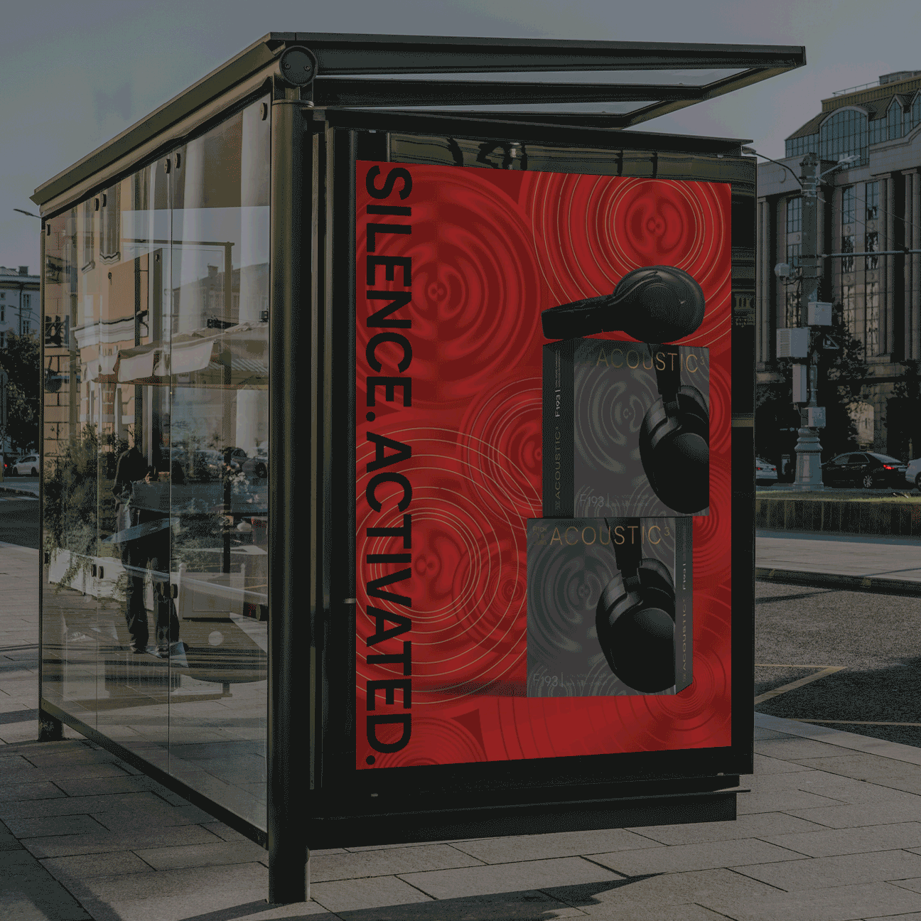
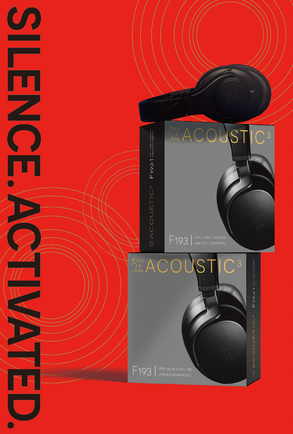
To execute this idea, I produced a design for printed packaging, and a retail-ready poster suitable for a shop window or endcap.
I started with a package design for a headphone brand named Fitch&Burg. Flooding the background with the Ripple Effect, I expressed the immersive experience of sound played by the new set of headphones.

With the package design finalized, the next focus was the retail posters and marketing POP displays. I enlarged the Ripple Fathom Effect for a 24”x36” poster, and planned out the layout and the color. Applying lighter overprinting color on a darker Fathom Effect creates a vibrant graphic, but in this project I wanted a more robust, heavily layered feeling, so the shades I chose for the overprint colors are rather deeper than we usually recommend.

Optical Illusion — Halation and CounterMotion
How does the illusion work? That depends on the effect. In this piece, the Ripple effect uses counter-motion and halation to deepen the appearance of pulsing motion.

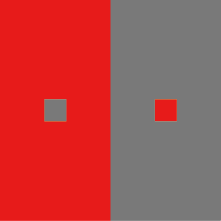


When you look at the squares above, the border between red and gray or green might look glowing— but it's not. This “glowing" is called halation. Your eyes can easily be tricked by movement, too. When you see two elements move in opposite directions, your eyes "capture" more speed even though the rate is not changing.
I worked with Fathom techs to create and work with this effect. Custom effects can be created depending on the intended goal. Talk to us if you have an idea you want to explore.
Here’s an interactive preview generated by Fathom Designer. Try dragging the poster to change your viewpoint and observe the effect shifting.
The goal of this exercise was to translate the nuance of an aural experience into a graphic that expresses all that in motion, printable on packaging. Fathom Effects are versatile and can be applied to all aspects of branding. So we now have an effect applied to digital marketing, physical packaging, and retail POP displays, viscerally connecting them all to the brand story.